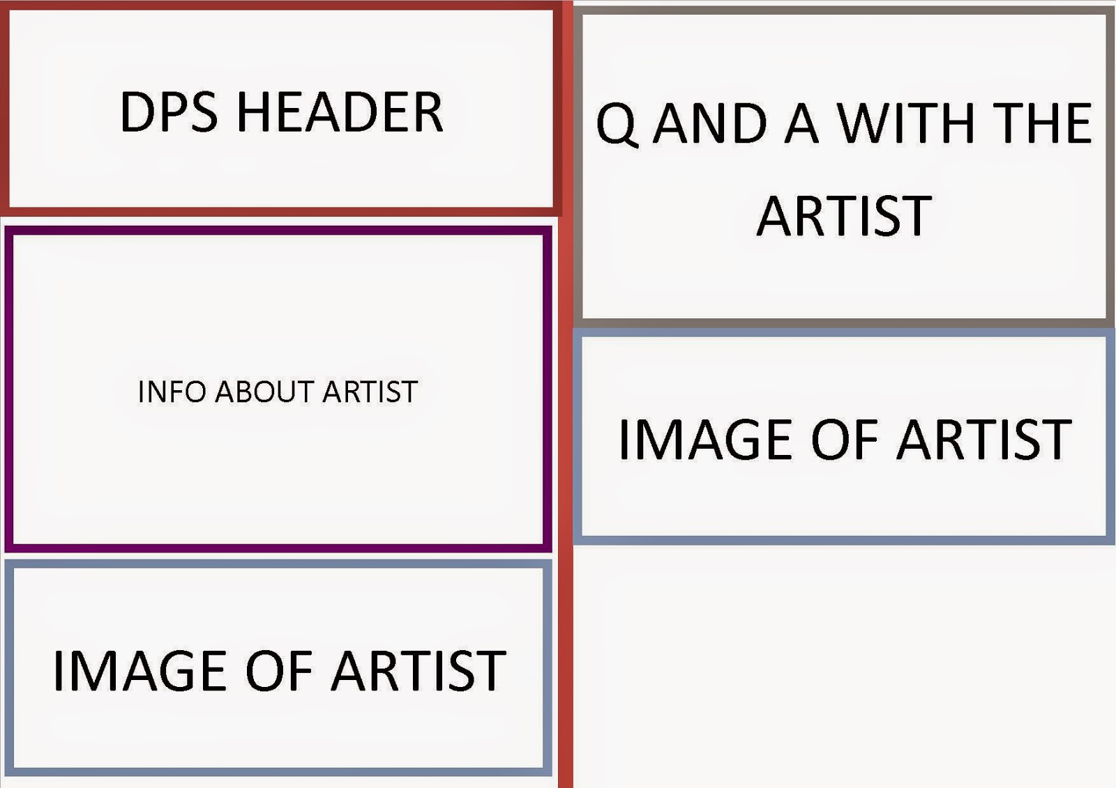
This is my final flat plan for the double page spread. This design is meant to enhance the text by suing images in such places like the bottom of the first page and the centre of the second page which allows the text to be more entertaining. This is because the text has images to back it up and so the reader has images and colours to entertain them rather than there just being text on the page. However, it does not target the intended audience very well though because the text still dominates the page and will bore the reader, the images are either at the bottom of the page or the centre and both serve no real purpose in entertaining the reader. If anything it alienates the reader as this format is not used often because it muddles up the text and makes it harder for the reader to read the articles. To conclude, I think that this design alienates the reader and does not suit the target audience of alternative/indie fans.

No comments:
Post a Comment