These are the designs that I created to help decide the final form the double page of the school magazine would take.
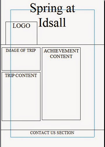
This is my first double page design which clearly shows the title to reader clearly and the images around the title will engage the reader enough to make them want to read on through the magazine. I think the distribution of both text and images will engage the reader greatly and entertain them but have enough text (intellectual content) to engage the older audience who are willing to read more text.
This is my second design which has more media assets such as the arrow to indicate to turn the page for more content, this will engage the reader more so that they will be less deterred to read through the magazine. These features will appeal more to the audiences who do not wish to read through heaps of text without any images to make the text more entertaining.
The final design is the most engaging in my opinion as the double page spread is balanced in both text and image so it appeals to a range of audiences in the school and will not deter any readers hopefully.
Overall, the last and final design is the best in my opinion as the balance of text and images engage the reader greatly an will overall improve the look of the final product greatly as well so that is why I will use the final design for the producing of the double page spread.


No comments:
Post a Comment